Brand guidelines — Quick reference
Essential rules for logo, colour, typography, imagery and UI components for Quenaro and partners across Australia.

Purpose & tone
Quenaro's visual identity blends clean modern geometry with vibrant neon accents to convey creativity, clarity and Australian professionalism. Use these quick rules as a single-page reference for designers and stakeholders.
- Voice: confident, collaborative, craft-focused.
- Primary use: branding, web, packaging, and marketing materials.
- Avoid cluttered layouts and low-contrast text on busy imagery.
Quick facts
- Brand: Quenaro
- ABN: 83 582 913 204
- Head: Sydney, Australia

Logo usage
Primary mark: Use the full logo lockup on light or dark backgrounds with clear space = 1x logo height.
- Do: maintain proportions, ensure legibility at small sizes.
- Don't: stretch, change color, or add effects.
Color palette
Primary palette balances neon accents with deep neutrals. Use accent sparingly for emphasis.
#0A0F2D
#FF00FF
#00FFFF
Usage table
| Role | Colour |
|---|---|
| Background | #0A0F2D |
| Accent | #FF00FF / #00FFFF |
| Text (primary) | #FFFFFF |
Typography
Primary: Inter / Poppins — weights 400,600,700 for web and print. Use 1.4x line-height for body copy.
Hierarchy: H1 display-6, H2 h4, H3 h5, body 16px.
Examples
Imagery & photography


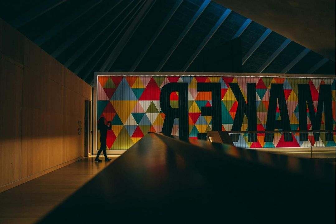
Photography should be high-contrast, editorial, and cropped for strong focal points. Prefer natural Australian contexts where possible.
UI components
Buttons, inputs and cards follow the neon accent system with clear states:
Accessibility: maintain 4.5:1 contrast for body text and 3:1 for large text.
Assets & downloads
Selected applications
Packaging — Retail launch
Consistent lockups, bold accent panels, and photography treatment to highlight product heritage.
Website — Landing page
Hero treatment using deep navy gradients with cyan CTAs and bold typographic hierarchy.
Need the complete brand kit?
Contact Quenaro to receive source files, extended usage examples and licensing details.